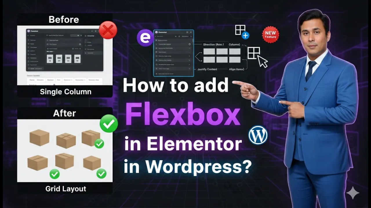
Flexbox has become one of the most useful layout systems for designing modern and responsive web pages. In Elementor, Flexbox Containers provide a flexible way to structure content without relying on the older section and column system. If you are editing a page in Elementor and want to create structured layouts using rows and columns, the Flexbox container makes the process simple and efficient.
In this guide, you will learn how to add Flexbox in Elementor while editing a web page on a WordPress website. The process is straightforward and involves selecting a layout structure, editing the container settings, and adding content to the layout.
Opening Elementor to Edit a Page
Before adding Flexbox, you need to open the Elementor editor for the page you want to design.
When you start editing a new page in Elementor, you will see the Elementor editing interface. The page editing screen displays a workspace in the center where the page layout is built. On the left side, there is a toolbar that contains widgets and editing options.
In the middle of the screen, you will notice a plus (+) icon. This icon is used to add layout structures to your page. Whenever you want to start designing a new section of the page, you begin by clicking this plus icon.

This is the starting point for adding a Flexbox container.
Adding a Flexbox Layout in Elementor
To add a Flexbox container, you simply need to select the layout structure from the options available after clicking the plus icon.
Step 1: Click the Plus Icon
When you are editing a page in Elementor, locate the plus icon in the center of the screen. Clicking this icon allows you to add a layout structure to your page.
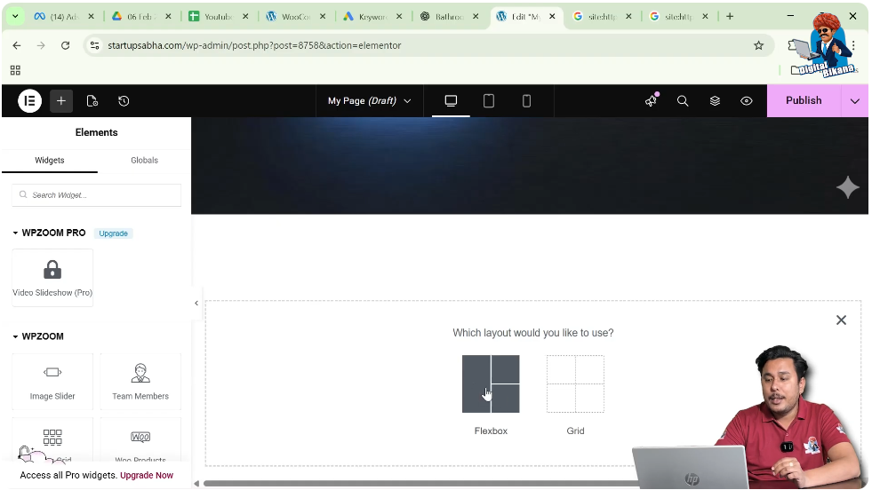
Once you click the plus icon, Elementor will ask you to choose the layout type.
Step 2: Select the Flexbox Option
After clicking the plus icon, you will see layout options. From these options, you need to select Flexbox.
Flexbox allows you to create containers that can include rows, columns, or combinations of both. This layout system is flexible and makes it easier to control alignment, spacing, and responsiveness.
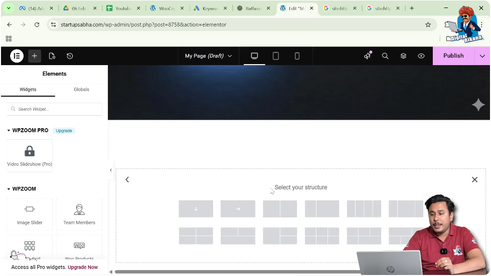
Step 3: Choose the Flexbox Structure
Once Flexbox is selected, Elementor will ask you to choose the structure of the container. Different structures are available depending on how you want to arrange the content.
Some of the commonly available structures include:
- One row and one column
- One row with two columns
- One row with four columns
- A layout where one column is wider than the other
- Single column layout
- Row-based layout
Each structure represents a different arrangement of rows and columns that you can use for your design.
For example:
- A single column structure is useful for headings, paragraphs, or large images.
- A two-column structure can be used for text on one side and an image on the other.
- A four-column structure can be useful for features, services, or icon sections.
You can choose the structure depending on the design requirement of your web page.
Understanding Different Flexbox Structures
Elementor provides multiple layout structures when you choose Flexbox. These structures help you create different page designs easily.
Single Row and Single Column
This structure contains only one column inside one row. It is often used when you want to place a single element such as a heading, banner image, or text block.
One Row and Two Columns
This layout divides the container into two columns. It is commonly used for layouts such as:
- Image on the left and text on the right
- Text on the left and image on the right
Uneven Two Column Layout
In this structure, one column is wider than the other. This type of layout is often used when one section requires more space, such as:
- A large content area with a smaller sidebar
- A large image with a small text section
Four Column Layout
This structure divides the row into four equal columns. It is commonly used for:
- Service sections
- Feature highlights
- Icon grids
Column-Based Layout
Some layouts are arranged vertically as columns rather than horizontally as rows. These are useful when stacking elements vertically on the page.
Elementor provides several structure variations so you can select the one that best fits your page design.
Selecting and Editing the Flexbox Container
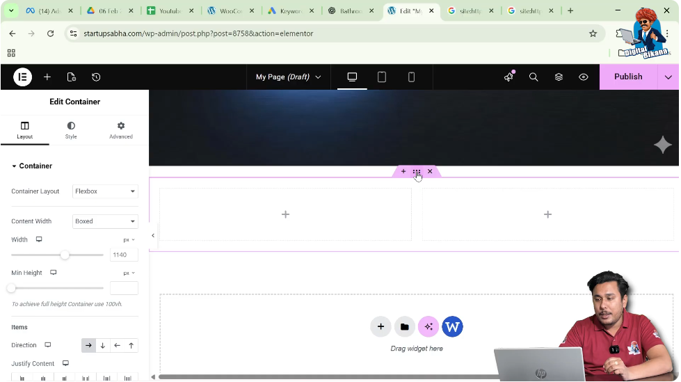
After choosing the Flexbox structure, Elementor automatically inserts the container into the page layout. At this point, you can start editing the container settings.
Step 1: Click on Edit Container
To edit the Flexbox container, click on the six dots icon located at the top of the container.
These six dots represent the container control. Clicking this icon allows you to modify the container settings.
Once you click on it, the editing options will appear in the left-side toolbar.
Container Editing Options in Elementor
When you click the container icon, Elementor provides three main editing options in the left-side panel.
These options are:
- Layout
- Style
- Advanced
Each of these sections allows you to control different aspects of the Flexbox container.

Layout Settings
The first option available is Layout.
In the Layout section, you can control how the container behaves and how the content is arranged inside it.

Container Layout
Here you will see that the container layout is set to Flexbox, which is the layout type you selected earlier.
Flexbox controls how elements are arranged inside the container.
Content Width
Another important setting is Content Width.
There are usually two options available:
- Boxed
- Full Width
Boxed Layout
When the content width is set to Boxed, the content stays within a fixed width area in the center of the page. This is commonly used in many website designs to maintain a structured layout.
Full Width Layout
When the content width is set to Full Width, the container stretches across the entire screen width.
This is commonly used for:
- Hero sections
- Image banners
- Full-width backgrounds
You can choose either option depending on the design requirement.
Adding Content to the Flexbox Container
After setting the layout, you can start adding content inside the container.
Elementor allows you to drag and drop widgets into each column of the container.
You can add elements such as:
Each column inside the Flexbox container can hold multiple widgets. This allows you to build complex layouts using simple drag-and-drop actions.
Style Settings
The next editing section available in the container is Style.
The Style tab allows you to customize the visual appearance of the container.
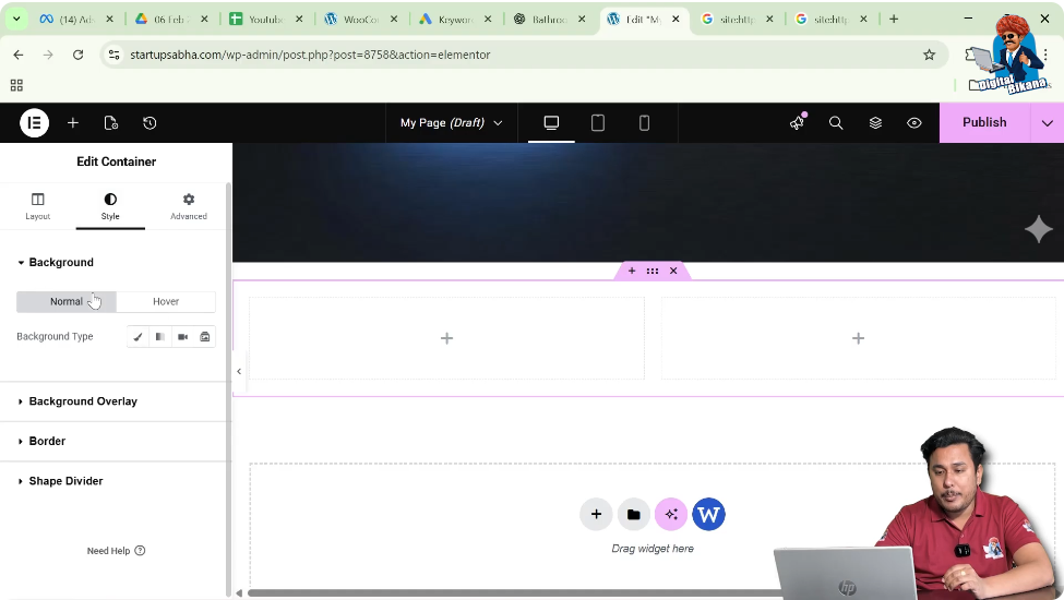
Background
You can add a background to the container. This can include:
- Solid color
- Gradient color
- Background image
- Video background
Adding a background helps improve the visual design of the section.
Background Overlay
The background overlay option allows you to apply an overlay effect on top of the background image or color.
This is useful when you want to make text more readable on top of an image.
Border
The border option allows you to add borders around the container. You can control:
- Border width
- Border style
- Border color
Borders can help visually separate sections of a webpage.
Shape Divider
The shape divider feature allows you to add decorative shapes between sections.
Shape dividers are often used in modern web design to create smooth transitions between sections.
Advanced Settings
The third editing option available in the container settings is Advanced.
This section provides additional control over the container behavior and styling.

Layout Adjustments
You can adjust advanced layout settings that affect how the container behaves in relation to other elements.
Motion Effects
Motion effects allow you to add animation or scrolling effects to the container.
These effects can improve the visual interaction of the webpage.
Transform
The transform option allows you to apply transformations such as:
- Rotate
- Scale
- Move
- Skew
These options help create dynamic design effects.
Responsive Attributes
Responsive settings allow you to control how the container behaves on different screen sizes.
You can adjust layout settings for:
- Desktop
- Tablet
- Mobile
This ensures that your website looks good on all devices.
Custom CSS
If you are using Elementor Pro, you can add Custom CSS to the container.
This allows developers to apply advanced styling beyond the default options.
Why Flexbox is Useful in Elementor
Flexbox containers provide several advantages when designing websites in Elementor.
Flexible Layout Control
Flexbox allows you to easily control the alignment and spacing of elements.
Better Responsiveness
Flexbox layouts adapt well to different screen sizes, making responsive design easier.
Simplified Design Structure
Instead of managing multiple sections and columns, Flexbox containers simplify the layout structure.
Improved Performance
Using containers instead of multiple nested elements can improve the performance and structure of the page.
Using Flexbox While Designing a WordPress Page
When designing a page in Elementor on a WordPress website, Flexbox containers can help you create organized layouts quickly.
The process is simple:
- Open the page in Elementor.
- Click the plus icon.
- Select Flexbox layout.
- Choose the container structure.
- Edit the container settings.
- Add content inside the container.
By following these steps, you can easily design sections of your webpage using Flexbox containers.
Conclusion
Adding Flexbox in Elementor is a simple and effective way to create flexible page layouts while editing a webpage on a WordPress website.
By clicking the plus icon, selecting the Flexbox option, choosing the structure, and editing the container settings, you can quickly build structured layouts using rows and columns.
The container editing options such as Layout, Style, and Advanced settings provide full control over the appearance and behavior of the layout. You can adjust content width, add backgrounds, apply borders, use motion effects, and even add custom CSS if required.
Once the container is added, you can easily start placing content inside it and continue designing the page according to your needs.
This is how you can add Flexbox in Elementor while editing a web page on a WordPress website.
Related Posts