
Welcome to this article. In today’s lesson, we are going to explore why a mobile-friendly website is not just a bonus but a critical requirement for SEO success.
With mobile traffic dominating the web, your SEO performance depends heavily on how your site performs on mobile devices. If your website does not deliver a smooth mobile experience, you are not only losing visitors but also losing rankings.
Let’s understand why mobile optimization is essential and how it directly impacts search engine visibility.
The Rise of Mobile Traffic
Over 60% of global web traffic now comes from mobile devices.
This means that most users are browsing websites through smartphones and tablets instead of desktops. If your site is not optimized for mobile screens, you are limiting your reach to a large audience.
Mobile traffic is no longer secondary. It is primary.
Ignoring mobile users means ignoring the majority of your potential visitors.
What Is a Mobile-Friendly Website?
A mobile-friendly design means your website adjusts seamlessly to different screen sizes.
It should:
- Load quickly
- Be easy to navigate
- Display properly on smaller screens
- Avoid horizontal scrolling
- Eliminate the need for zooming
Users should not have to pinch, zoom, or struggle to read content.
A smooth mobile experience ensures better engagement and satisfaction.

Google’s Mobile-First Indexing
Google now uses mobile-first indexing.
This means Google primarily checks your mobile site when deciding how to rank your pages.
Even if someone searches from a desktop device, Google evaluates the mobile version first.
If your mobile version is poorly designed, slow, or incomplete, your rankings may suffer across all devices.
Mobile optimization directly impacts overall visibility.
SEO Benefits of a Mobile-Friendly Website
Having a mobile-friendly website provides several important SEO benefits.
It:
- Improves page speed
- Reduces bounce rate
- Boosts user engagement
- Increases time on page
- Enhances search rankings
A positive mobile experience signals to search engines that your website provides value to users.
Better experience leads to better performance.
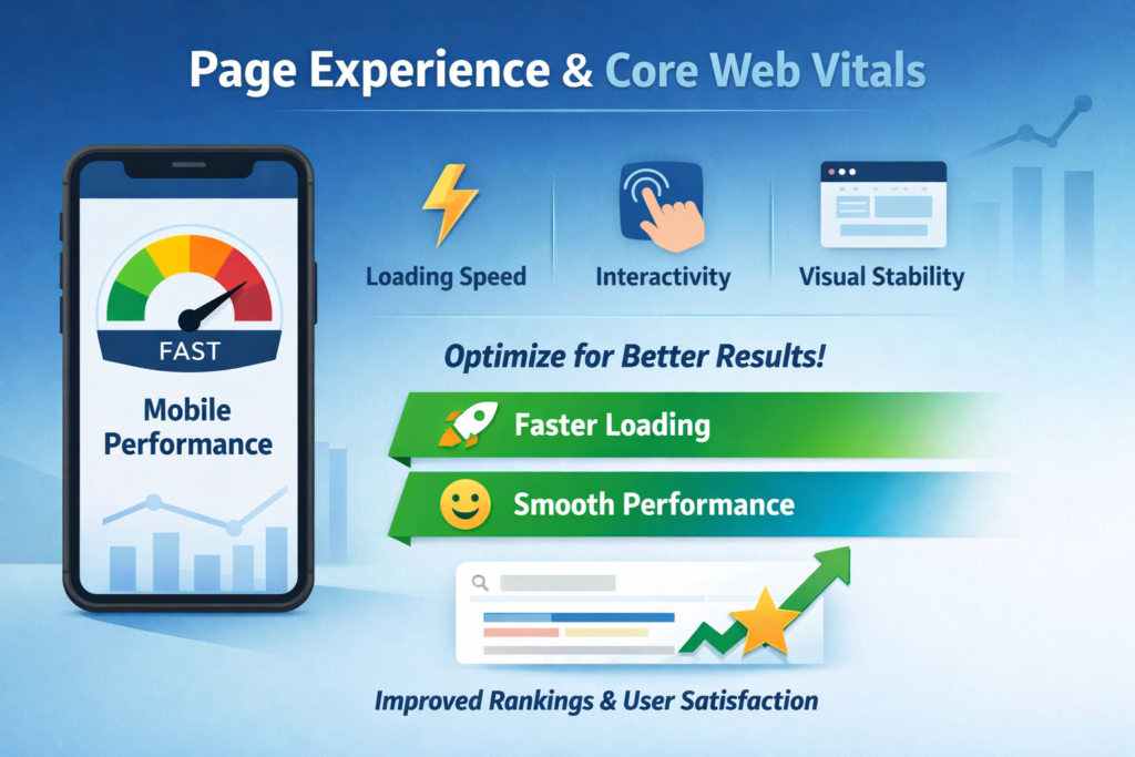
Page Experience and Core Web Vitals
Google’s Page Experience update and Core Web Vitals measure mobile performance as well.
These metrics include:
- Loading speed
- Interactivity
- Visual stability
A mobile-friendly site makes it easier to optimize these factors.
Faster loading and smooth performance improve rankings and user satisfaction.
Common Mobile SEO Mistakes
Avoid these common mobile optimization mistakes:
- Tiny fonts that are hard to read
- Buttons placed too close together
- Slow loading times
- Content that does not adjust to smaller screens
- Intrusive pop-ups
These issues frustrate users and negatively impact SEO performance.
Poor mobile design increases bounce rates and lowers engagement.
How to Check If Your Website Is Mobile-Friendly
You can check your website’s mobile performance using several tools:
- Google’s Mobile-Friendly Test
- PageSpeed Insights
- GTmetrix
- Lighthouse Reports
- Chrome Developer Tools
These tools analyze responsiveness, loading speed, and usability.
Regular testing ensures your website meets modern standards.

Best Practices for Mobile SEO
Here are some best practices to follow for mobile optimization:
- Use responsive design
- Avoid intrusive pop-ups
- Compress images
- Keep font size readable
- Ensure touch elements are easily clickable
- Optimize page speed
These practices improve both SEO and user experience.

Step 1: Use Responsive Design
Adapt to All Screen Sizes
Responsive design ensures your website automatically adjusts to different devices.
Step 2: Improve Page Speed
Compress and Optimize
Reduce image sizes and eliminate unnecessary scripts.
Step 3: Make Text Readable
Use Proper Font Sizes
Ensure text is large enough to read without zooming.
Step 4: Optimize Touch Elements
Improve Clickability
Buttons and links should be spaced properly for easy tapping.
Step 5: Avoid Intrusive Pop-Ups
Maintain Clean Layout
Large pop-ups can block content and frustrate users.
Mobile Experience and Bounce Rate
When users land on a mobile site that is slow or difficult to navigate, they leave quickly.
This increases bounce rate.
High bounce rates can signal to search engines that users did not find the page helpful.
Improving mobile usability keeps users engaged longer and reduces bounce rate.
Mobile Optimization and Conversions
Mobile-friendly design not only improves rankings but also increases conversions.
When users can:
- Navigate easily
- Read clearly
- Click without difficulty
They are more likely to:
- Subscribe
- Purchase
- Contact you
- Explore more pages
Better usability leads to higher conversions.
Step-by-Step Mobile Optimization Checklist
Step 1: Test Mobile Performance
Use SEO Tools
Check responsiveness and loading speed.
Step 2: Implement Responsive Design
Ensure Layout Flexibility
Make your website adaptable to different screen sizes.
Step 3: Optimize Media
Compress Images
Reduce file sizes for faster loading.
Step 4: Simplify Navigation
Improve User Flow
Use clean menus and avoid clutter.
Step 5: Monitor Core Web Vitals
Track Performance Metrics
Regularly review loading speed and visual stability.

Why Mobile Optimization Is a Core Requirement
In summary, a mobile-friendly design is not optional.
It is a core requirement for modern SEO.
With mobile-first indexing, Google prioritizes the mobile version of your website when determining rankings.
If your mobile experience is poor, your overall SEO performance suffers.
Mobile optimization ensures:
- Better rankings
- Happier users
- Higher conversions
- Improved engagement
Optimizing for mobile is the right place to start if you want long-term SEO success.
Final Summary: Mobile First, SEO First
To recap, mobile traffic dominates the internet, and Google evaluates your mobile site first.
A mobile-friendly website:
- Loads fast
- Adjusts to screen sizes
- Provides smooth navigation
- Enhances user experience
Avoid common mistakes such as tiny fonts, slow loading, and cluttered layouts.
Follow best practices like responsive design, image compression, and clear touch elements.
Mobile optimization is not just a design upgrade. It is a foundational element of SEO strategy.
If you want better rankings, satisfied users, and stronger conversions, prioritizing mobile performance is essential.
Start with mobile, and your SEO will follow.
Related Posts