Creating a full width container in Elementor is an essential step when designing modern and responsive websites. A full width layout allows your content to stretch across the entire screen, giving a clean and professional appearance. It is commonly used for banners, hero sections, and visually impactful designs.
In this article, we will explain how to add a full width container in Elementor step by step. The explanation follows a structured approach and expands each concept in detail so that you can clearly understand how to apply it on your website.
Accessing the Elementor Editor
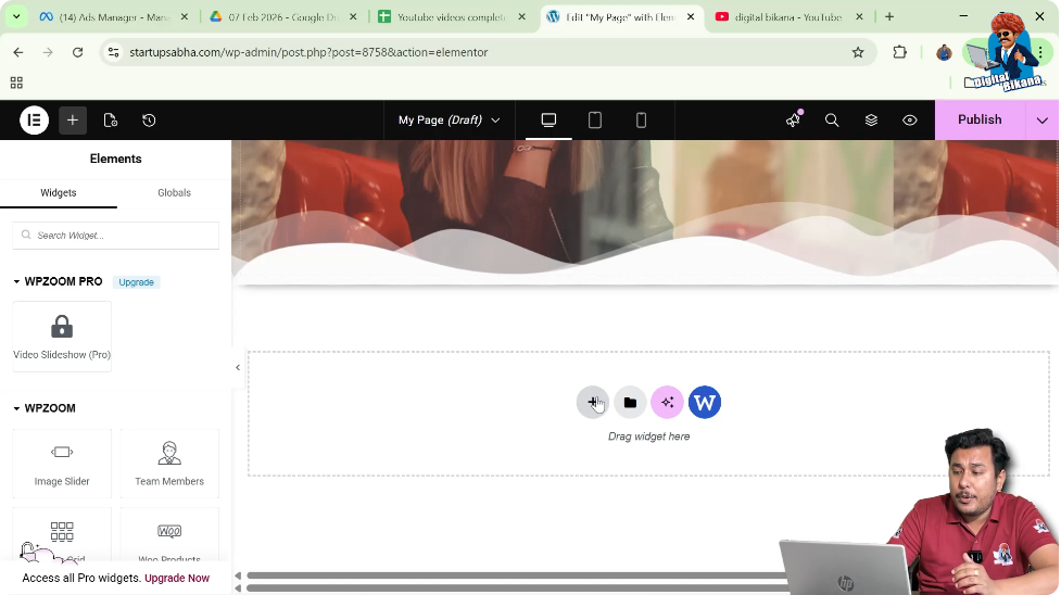
To begin, you need to open Elementor and start editing your web page.
As shown in the process, you are inside the Elementor editor and working on a web page. In the middle of the screen, there is a plus icon that allows you to create a new section.
This is the starting point for adding a full width container.
Creating a New Section
Step 1: Click on Plus Icon
Click on the plus icon displayed in the middle of the screen.
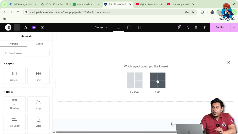
Step 2: Select Layout Type
You will be asked to choose a layout:
Select Grid.
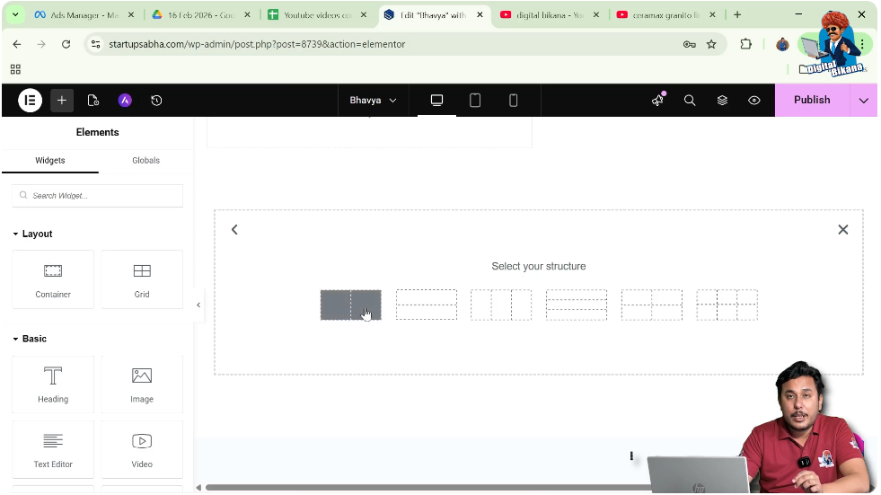
Step 3: Choose Structure
Select a structure such as:
- One row
- Two columns
This creates a grid layout section.
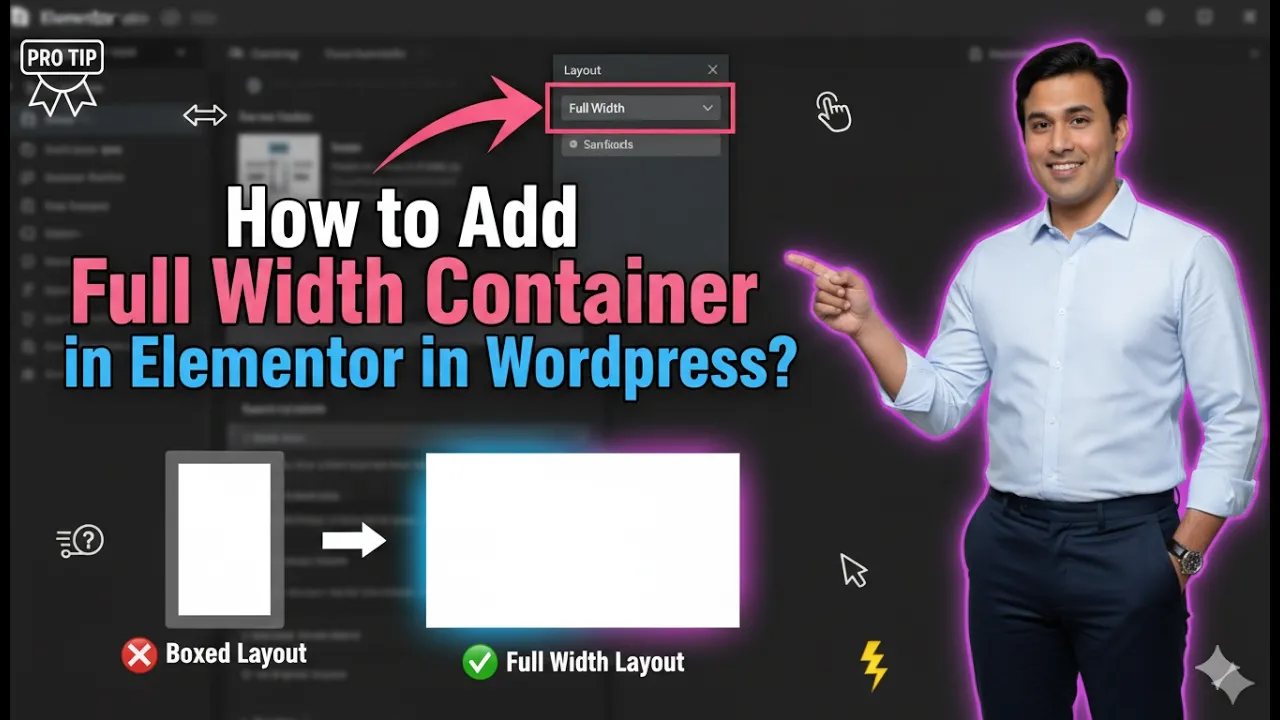
Making Section Full Width
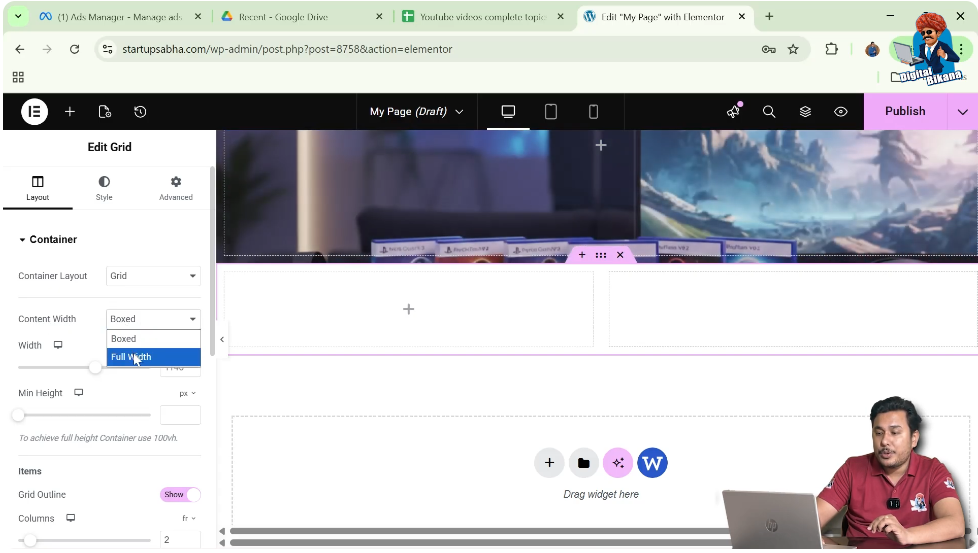
Step 4: Edit Section Container
Click on the six-dot icon above the section to edit the container.
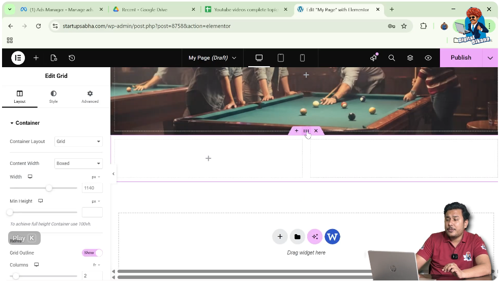
Step 5: Change Content Width
In the left-side toolbar under layout settings:
- Locate the Content Width option
- Change it from Boxed to Full Width
This makes the entire section stretch across the screen.
Adding a Container Inside the Section
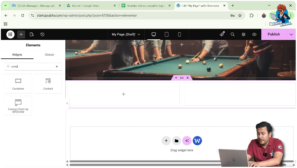
Step 6: Add Element
Click on the Add Element button in the top black header line.
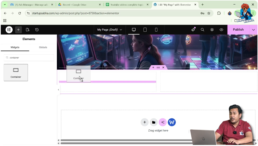
Step 7: Search for Container
In the widgets panel, search for Container.
Step 8: Drag and Drop Container
Drag the container widget and drop it into the desired position, such as:
- First row
- First column
The container will now appear inside the section.
Editing the Container
Step 9: Select Container
Move your cursor to the container and click on the gray box icon in the top left corner.
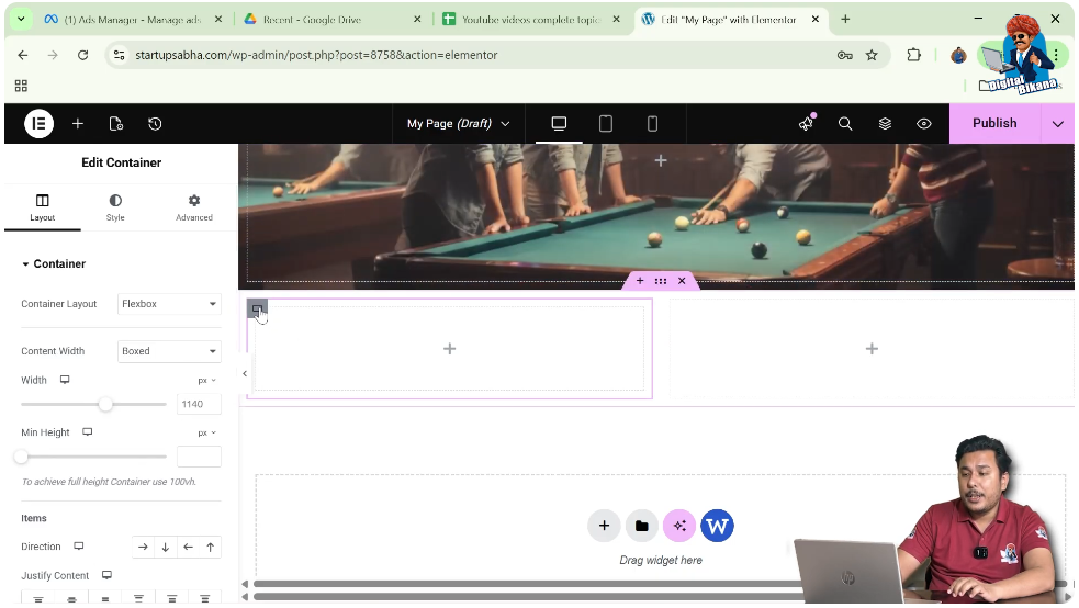
Step 10: Open Layout Settings
In the left-side toolbar, go to the Layout settings.
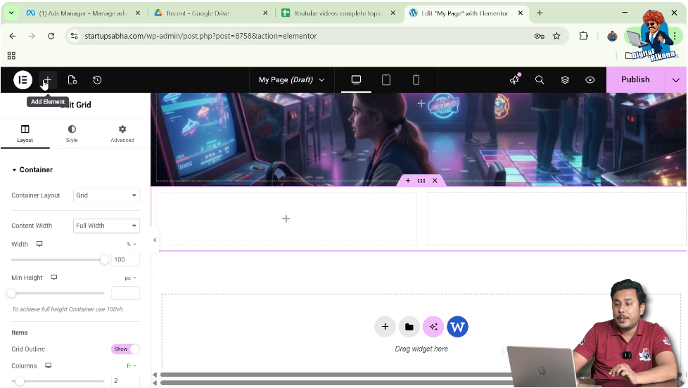
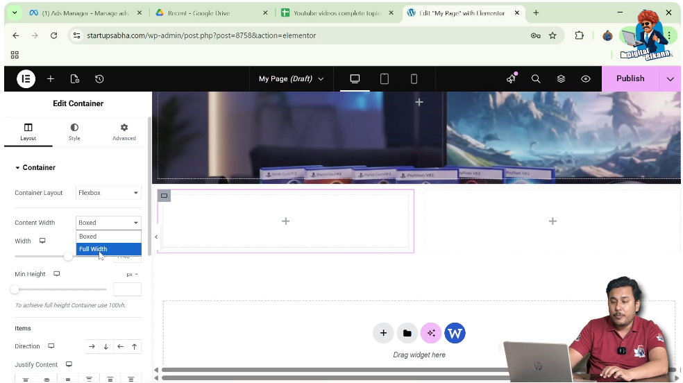
Setting Container to Full Width
Step 11: Change Content Width
In the container settings:
- Locate the Content Width option
- Select Full Width
This ensures that the container also stretches across the available space.
Understanding Full Width Layout
A full width container means:
- Content spans the entire screen width
- No fixed margins on left and right
- Better use of screen space
Difference Between Boxed and Full Width
Boxed Layout
- Content is limited to a fixed width
- Leaves margins on both sides
Full Width Layout
- Content expands to full screen
- No side margins
Practical Example
In the demonstrated process:
- A grid section is created
- The section is set to full width
- A container is added inside the section
- The container is also set to full width
This results in a fully stretched layout.
Benefits of Full Width Container
Better Visual Impact
Full width sections look modern and attractive.
Improved User Experience
Content is more engaging and easier to view.
Flexible Design
You can create banners, sliders, and wide layouts.
Common Mistakes to Avoid
Not Changing Section Width
Setting only the container to full width may not work if the section is still boxed.
Ignoring Responsiveness
Always check how full width looks on mobile devices.
Overusing Full Width
Use full width only where necessary.
Best Practices
- Use full width for hero sections
- Maintain proper spacing
- Combine with padding for better design
- Test on all screen sizes
Final Understanding
Adding a full width container in Elementor involves two main steps: setting the section to full width and then setting the container to full width. Both must be configured properly to achieve the desired layout.
Conclusion
A full width container is a powerful design feature in Elementor that helps you create modern and visually appealing layouts. By understanding how to adjust content width settings, you can easily control how your website appears on different screen sizes.
By following the steps explained in this guide, you can confidently create full width containers and enhance the overall design of your website.
Related Posts